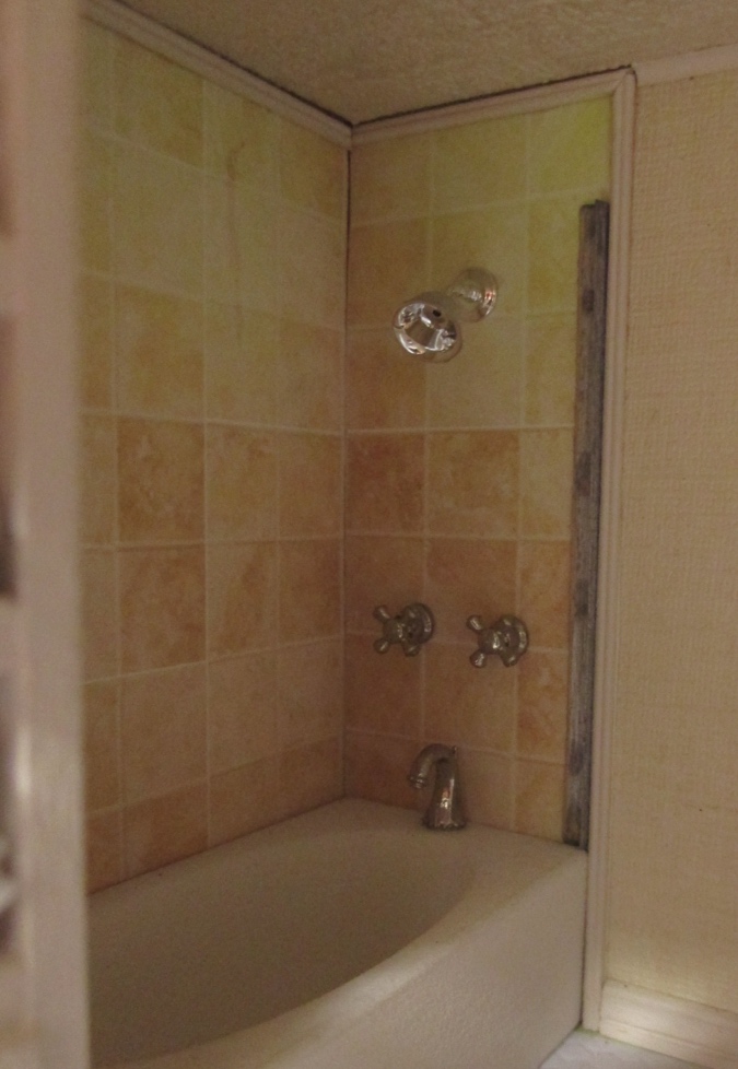
Once upon a time the Victorianna had a pretty peach bathroom. This was the first room I finished (four years ago!) and I was really happy with it. The tiles were from Elf Miniatures and I loved the color.
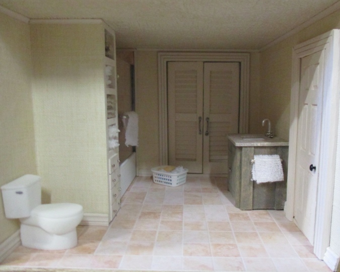
Fast forward a year. About six months after moving into our new house in San Francisco, I noticed the floor tiles had become discolored. The Victorianna had been sitting in the garage with sunlight shining on it through a window, and it hadn’t occurred to me until it was too late that this might cause damage. I suspect the tiles were ink jet printed.
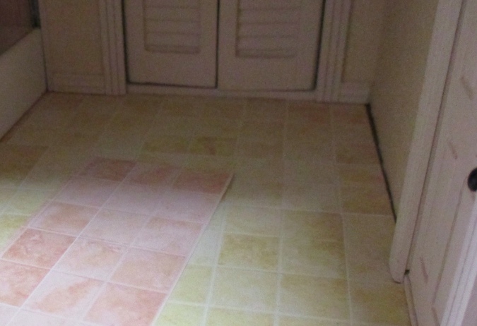
Only the floor was faded — the shower surround still looked okay. I replaced the flooring with a plastic sheet of hex tiles and hoped the shower tiles wouldn’t fade since they were tucked back in a corner.
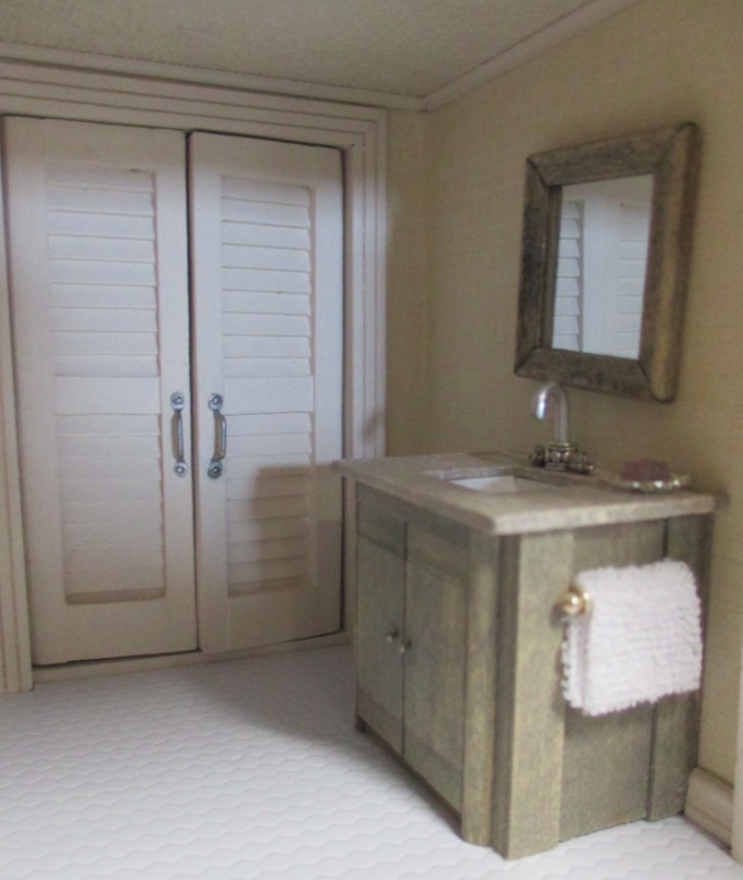
No such luck. It started with the upper right corner and gradually spread. With the house is almost finished, I didn’t feel good about leaving the bathroom in this state. And after fixing a similar, much more complicated issue in the Queen Anne Rowhouse, I figured if I could fix that, I can fix anything!
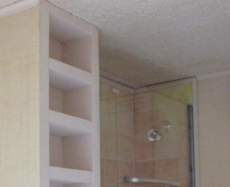
I started by removing the shower door. After a minute or two of unsuccessfully trying to pry it off, I got annoyed and punched it with my finger. The channel molding holding it in place broke, and the door fell into the shower. Almost too easy!
Next I peeled the tile off of the right wall. I was pleased to see I’d had the foresight to wallpaper almost all the way to the wall. This way I didn’t need to worry about a transition between the wallpaper and the new tile.
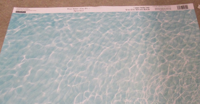
This is the scrapbook paper I picked out for the new tiles.
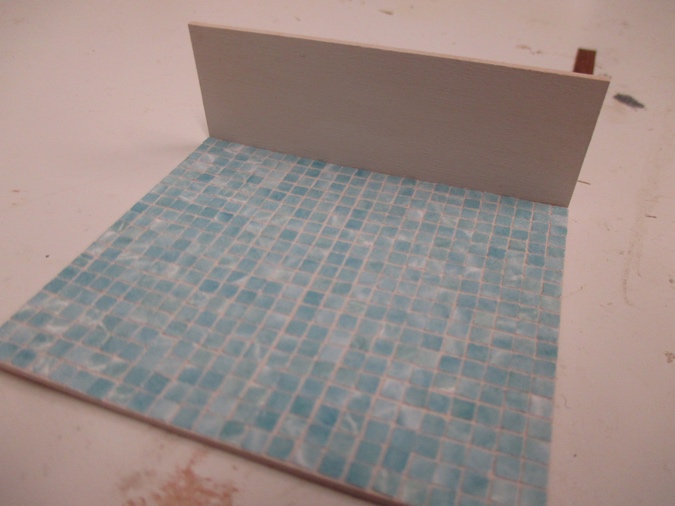
Like with the backsplash, I used 1/16″ thick basswood as the backing, and painted it with my Tuscan Beige trim color to make the grout. Then I glued on the tiny 1/8″ x 1/8″ squares one by one. It took a long time!
Originally the channel molding that holds the door was glued on top of the tile sheet. Since my tiles are now on a 1/16″ thick backing, I couldn’t do that again, or the plexiglass shower door wouldn’t fit. I cut the side piece to be 1/8″ narrower than the original piece had been, so the channel molding can sit outside of the tiles instead of on top.
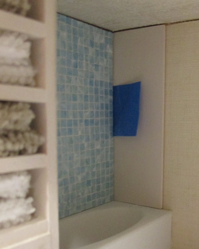
The left side of the surround can’t be seen from any angle, not even in the mirror, so I only did the two sides you can see.
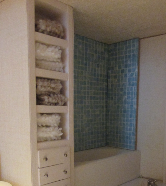
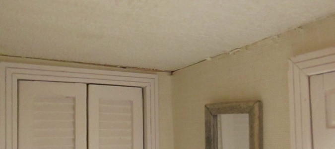
Because the new side piece is narrower than the tile that was there originally, I had to redo the ceiling molding that butts up against that side of the surround. I used small cove molding in here and didn’t have any of the same size to make a new piece, but I did have some slightly larger cove molding that I ended up not using in the kitchen. So, I tore out all of the existing molding to redo it.
Once all the tiles were glued on, I coated each one in clear Gallery Glass to make them shiny. Then I glued the fixtures on before gluing the tiles to the walls.
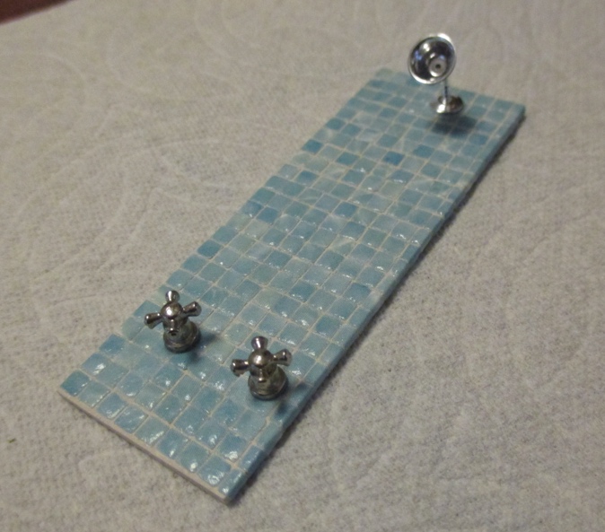
Oops, the showerhead is too high. So much for planning ahead. I was able to remove it and reglue it lower.
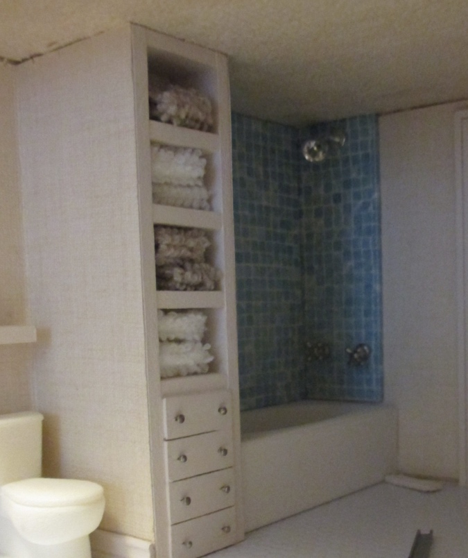
(Sorry for the grainy pictures. The bathroom is dark to begin with, and I was working on this in my dining room which isn’t well lit, and my camera hates me.)
The surround pieces weren’t exactly the right height and I ended up with a gap at the bottom. I filled this with white grout, which hopefully looks like caulking.
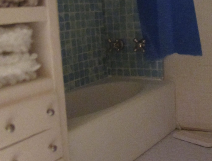
The first time I put this shower together, I attached channel molding to both sides of the shower door, and then glued in the shower door first, followed by the linen closet. This time, since the linen closet is staying where it is, I started by gluing a piece of channel molding to the wall.
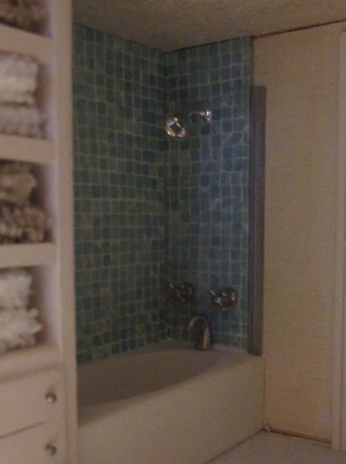
I glued the other piece of channel molding to the left side of the door.
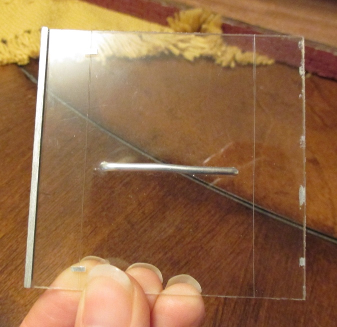
Then I added glue to the back side of that piece of channel molding, and slid the door into place. There might be glue smeared on the wall you can’t see, but hey, you can’t see it!
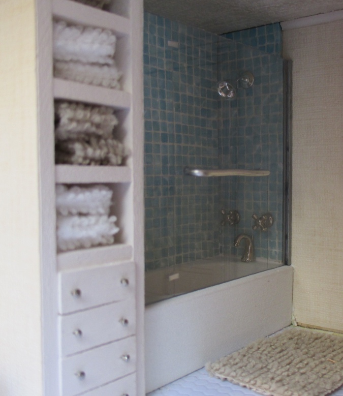
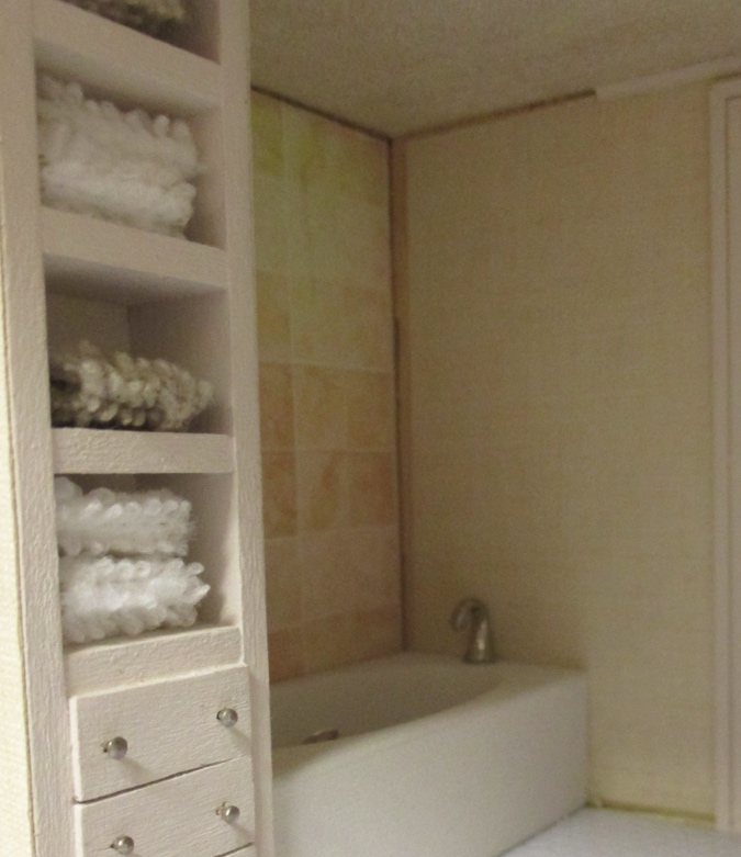
I replaced the ceiling molding and the piece of baseboard next to the tub, and then I figured I might as well really finish the room while I was at it, so I dug out this towel rack I bought a while ago from Elf Miniatures. It’s not on their website anymore, so I’m sorry I didn’t take a picture before adding the towels. I made the towels from a velvet swatch from Restoration Hardware.
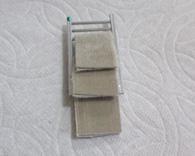
This wouldn’t stay put with tacky glue so I used super glue — always a risk, but it worked out. I just hope I never want to remove it!
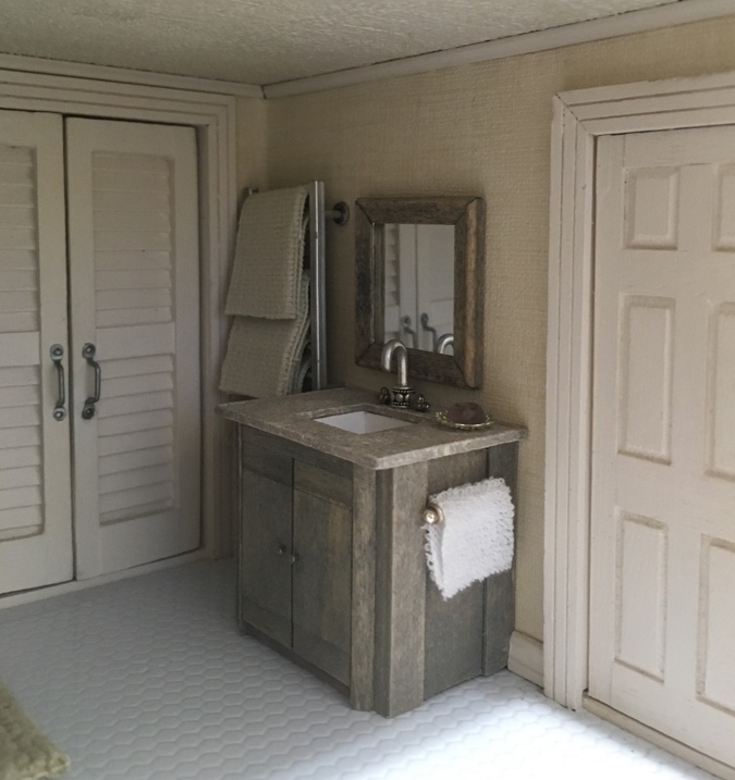
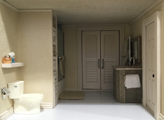
My least favorite thing about the new version of the bathroom is the bright white floor. It would look more realistic with dark grout, but wen I tried adding some, it wiped right off without sticking in the cracks. Redoing this floor was a pain the first time, and I don’t really have any better ideas, so I guess it’s here to stay.
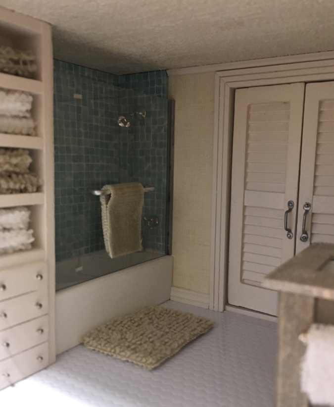
Honestly, I liked the pretty peach version better, but I can live with this. It’s the kids’ bathroom, anyway. There’s still the luxurious master bath upstairs.
 Emily is a freelance writer, miniaturist, and adventure game enthusiast.


That looks good. Honestly, you deserve an award. The results are great but I know I wouldn’t have the patience for all those tiny squares!
Thanks! I didn’t realize how long they took until I was in the middle of it, too far to turn back. The backsplash pieces were a lot smaller.
I really love the new blue tiles. You could always do the floor with the same tile in a larger square? Or maybe that would be too much blue. A blue and cream checkerboard pattern?
Stop, you’re temping me! :)
Your tile Re-do turned out Really Well Emily!
I love their blue color which compliments the beige AND the new white floor too. The color of the plush bath linens along with all of the other fittings, makes the children’s bathroom classic and very easy to maintain! :D
Thank you! There’s one last thing I want to add in here, a step stool so the kids can reach the sink. :)